We’ve reached the point of web saturation where it’s a surprise to find an eatery with no internet presence. Even small cafes with limited budgets often put together free Facebook pages with bare-bones information, although — astonishingly — some people are still not on Facebook. But even if they’re not on Facebook, today’s diners are web- and mobile-savvy, and they increasingly expect restaurants to provide all the information prospective customers want in order to decide where they’re going to spend their dining-out dollars.
Heavy Table staffers — with input from our readers — have found some things that happen too often, and some not often enough, on the web. These aren’t just mild annoyances, but things that can truly irritate visitors to sites — so much so that they may leave the site, and quite possibly avoid the restaurant. Seriously, people are passionate about these things. Listen up, restaurants! We have some suggestions (in some cases, desperate pleas) for you about your internet presence that will make future customers happier and more eager to visit your business.
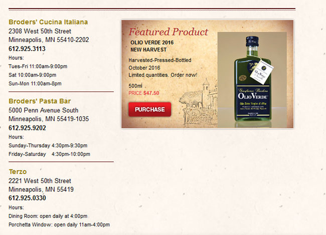
- The biggest pet peeve in our survey? Restaurants that don’t put their address and hours of operation on their home pages. Please, eateries, we beg you — don’t bury this crucial information in some hard-to-find place. Most people we talked with said this is hands-down the main reason they look up a restaurant website in the first place. The homepage is also a great place to put your external links (Facebook, Twitter, sister restaurants, etc.). Extra page views aren’t valuable if the potential diner is frustrated by not finding your hours. And note: One respondent said she’s stopped bothering with restaurant websites and just looks to Google or Yelp to provide this info.
- Provide contact info that actually works. If you have a phone number that someone will answer and then help customers, great. But if your phone line always goes straight to voicemail, or if you provide an email address or a web form and no one ever checks it, that only hurts you.
Screenshot - On a related note, if you’re going to have a website — and you should have a website — carve out some time on a regular basis to keep it updated. It’s great if you have your hours on the home page, but if the page says you’re open on Mondays and that has changed, it’s going to annoy the person who looked up your hours and showed up on Monday night. Same thing for menus — no one wants to see what your summer specials were in November. Extras like blogs are nice, if you have time to update them regularly. If you don’t? Delete. A blog that hasn’t been updated in 14 months implies that the rest of the site is out of date as well.
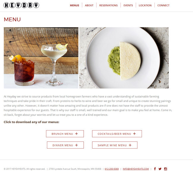
Screenshot - Another hot topic: menus. Please, please, please stop the madness of putting menus in PDFs that have to be downloaded. Stop it. Just don’t. Nobody likes it. Really. Nobody. Except maybe the web development person who billed you for the time it took them to do it. But that’s it. No one else.
- That said, please have menus online. If you have more than one menu, have all of them, including happy hour and wine lists, and be sure to include the hours that each menu is available. If your menu changes frequently, and this would be an unreasonable task, then put up a sample — clearly marked as such — to give potential diners some idea of what you have to offer. If your menu changes daily, consider taking a quick photo of it and posting it on your social media, making sure to link to it on your website. This is especially crucial for people with dietary concerns; they want to use your website to see if it’s safe for them to eat there. Don’t make them call and ask.
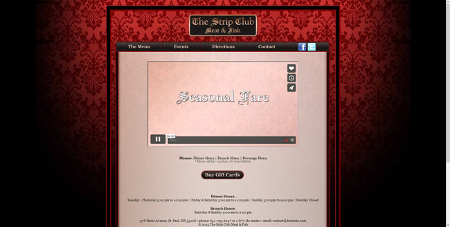
- Also greatly frowned upon: music or videos that automatically start up when the page loads. If you absolutely must have music or video on your site — and neither is necessary for a restaurant — make participation opt-in. Because when forced, many people will turn sound and video off as fast as they can, or leave your site for a quieter one.
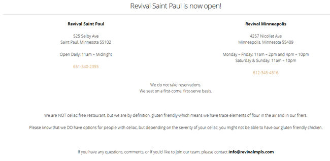
Screenshot - Save eloquence and cleverness for the food. Don’t waste it on the website. You can pour hours into developing lengthy chef bios and long mission statements, but most people will either not read them or will skim them while desperately trying to find the hours. As one respondent said, “I really don’t care about those things, although they seem to feel I should.” As for cleverness, don’t be coy. Be straightforward and use terms people are familiar with. There’s a restaurant out there (Revival, see above) using the phrase “gluten friendly.” What does that even mean? The restaurant is only friendly to people who eat gluten? Why not just say, “We’re not gluten-free” — or “we are” — and be done with it?
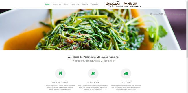
Screenshot - Photos matter. We realize this is a hard one, especially for small eateries on tight budgets. But when you post amateur photos, or stock photos, it cheapens your site and leaves a bad impression. Even if you can afford to have a only a few professional food shots done, it’s worth sacrificing something else to get those photos. A few representative photos of your interior space are helpful, too, so diners can get an idea of how to dress or what to expect in terms of size and ambiance.
- If you have live entertainment some or most nights, keep an updated calendar on your site. Diners looking for a quiet evening out will not be delighted to be seated next to the amp for a show they didn’t know about.
- Do you sell gift cards / certificates? Of course you do. Does your website help potential customers buy them? It should, or someone searching for a gift may just surf right on to the next restaurant on their list.
- The use of Flash. As in, don’t.
- Negative space is actually a positive. You don’t have to fill every square inch of web space with text and photos. One striking photo with a brief description can do more to motivate a potential diner than a page bulging with photos and text.
- Mobile sites. You can have the best website in the world, but if it’s reduced to unreadable, unsearchable squiggles on a smartphone, it’s not working.
- We can’t recommend this enough: Have people who are not your friends and relatives review your site. Good web design companies will recommend usability testing, and there’s a reason for that. Someone who doesn’t know you and has no vested interest in being kind to you will be more likely to say, “Hey, I can’t find your hours, and that Flash you use when the page loads takes forever, which is really annoying.”
Bottom line: Don’t design your site based on what you want people to pay attention to. Instead, pay attention to what people want from your site: simple, clean, basic information, easily found; regularly updated content; with a minimum of (or preferably, no) flashy bells and whistles.


Yes, yes YES! I cannot quite believe that all these points still need to be made because, like needing to brush your teeth before leaving the house, it has been true from Day One. Come on, restaurateurs: No video. Zero additional clicks to get your address & hours. Menus with prices. Proofreading. Current info.
Excellent points! Thank you for doing this research and posting it. As one of the few who is not on facebook (go ahead, judge away) I find it infuriating that some restaurants only have a facebook page. I tend not to visit those places since I can’t get reliable information.
One other pet peeve – main pages with no fixed header. The sections are huge and unmanageable on a phone and you have to scroll all the way up to the top or all the way down to the bottom to get hours/menu.
Thanks again! -asg
Preach!
Prices. If you don’t list them, I going to assume they’re more than I want to pay.
I am very tempted to post a link to this article as a FB comment on some restaurant profiles. My other pet peeve is a restaurant being active on FB or Twitter but then not using it to notify potential customers of timely information, such as if they are open on Thanksgiving or if they’ll be closed for an employee event.
On the one hand I don’t disagree with any of this. On the other hand I feel the offenders mentioned are, well, a bit undeserved of their mention.
As someone who has known people with actual celiacs as opposed to people with a gluten intolerance or allergy, I appreciate that they differentiate and mention that they may serve gluten free versions of their food, but cannot guarantee that someone with severe celiac will be able to safely enter the restaurant and eat. Calling it gluten friendly is weird, if an afterthought.
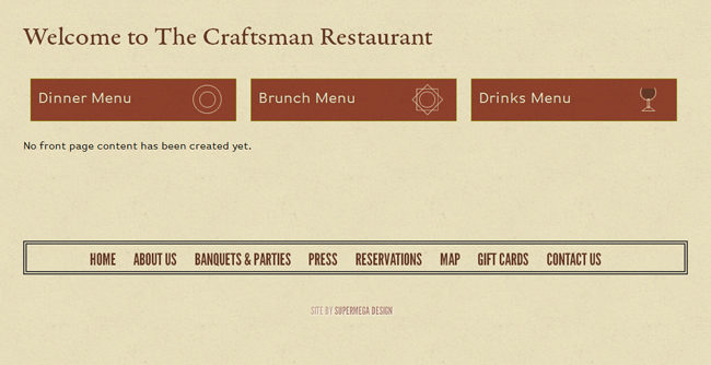
Driving by the Craftsman yesterday they appear to be going through a new management transition. I assume their website is being updated as part of this and why it is under construction. Their old page was perfectly serviceable if dated.
Doesn’t detract from your overall point, but surely better examples exist out there. The Chino Latino website comes to mind and guilty of almost the whole list. Really the whole Parasole Dining group…
Ben, I jusr checked the Chino Latino site and it is horrible!
Also, PARKING – since 99.9% of us get to restaurants via cars. If you’ve got your own lot be sure to brag about it. If you have a lot that fills quickly or if it’s street parking only, tell me so I’m up for the challenge, wear walking shoes and not grumpy when I’m seated. Nearby ramps?- Fine. Just tell me the best alternatives for parking spots.
I agree with the IANMERCHANT person, not having prices on your online menu is the most obnoxious thing about a website. I just won’t show up, so I don’t see how this benefits them.